Project:
Relaunch and reposition the KINSA brand increasing donations and brand traction
Involvement:
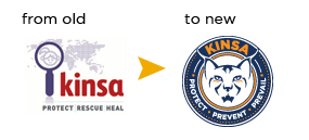
Insight-led repositioning and brand logo design
Project: Responsible for brand workshop, company brand proposition and positioning, logo design development, new collateral and project managing website development.
The charity foundation was not connecting with target audiences and as a result, not gaining the level of donations they desired. Through an insight-led workshop, quickbrownfox was able to develop a powerful new brand proposition and corresponding brand story and logo design to give the foundation a more professional image.
Objective:
Relaunch KINSA globally to create a more professional brand image, positioning the company as modern, strong and capable with the view to increasing donations and building a strong connection with the brand amongst potential donors.
Strategy:
Strategically reposition the brand to present a more professional and trustworthy image. Create a better emotional connection with the key target markets through a strong brand story delivered through both the new logo and the new tagline (“PROTECT. PREVENT. PREVAIL”). Design a new logo that conjures a sense of capability, strength and knowledge and presenting as a credible business that will use the donated funds wisely.
Creative:
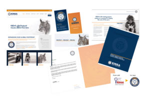
New logo design, stationery and collateral materials created through comprehensive workshop which helped identify their core values, visual language and tone of voice, resulting in a clarified way for them to communicate to market and provided an emotional connection through the Lynx and its back story. New website including revised donation page that clearly identifies where the funds are allocated per donation.
Results:
Brilliant customer and market feedback with an immediate response from donors. KINSA is now well placed to continue successfully into the future.
Finalist BADC Brand Identity Logo Design.
